
Redesigning World Courier’s Customer Portal for a global customer base

The context
Connecting People and Information Across a Global Enterprise
In mid-2024, World Courier, a global leader in healthcare logistics, aimed to revamp its Customer Portal, a digital platform that enables clients to create, track, and manage urgent medical shipments. My team was tasked with conducting a thorough review and suggesting updates to enhance the user interface, ensuring it aligned with the internal design system and was more user-friendly.
My role
As the sole designer on the project, I handled multiple responsibilities, including evaluations, customer interviews, focus groups, UI design, and accessibility guidance. I collaborated closely with World Courier stakeholders over several months, receiving continual feedback and guidance.
The Challenge
The original Customer Portal, introduced in 2019, had grown increasingly outdated. Although it was widely adopted, feedback from key users—mainly logistics professionals and pharmaceutical researchers—pointed to issues with usability, error management, and limited customization options. The need to address deep systemic issues in the platform’s interaction design, accessibility, and workflows emerged from the initial onboarding and walkthrough of the portal. The core challenges included:
Complex interactions and inconsistent UI components that confused users during time-sensitive tasks.
Insufficient error handling and support pathways are crucial in high-stakes logistics operations.
Inaccessible design patterns that limited the user experience for those using assistive technology.
Legacy infrastructure that created both design and development limitations.
The redesign also had to consider the use of sensitive customer information, as well as the legal and operational requirements of the healthcare industry, and be built on a modern, scalable UI framework—all without disrupting active user operations.
The Process
Heuristic Evaluation and User Interface (UI) Audit
I started with a heuristic evaluation of the platform, focusing on key workflows:
Create a shipment order
Track an existing shipment
Generate a shipment report
Using Nielsen Norman’s Severity Rating System, we assessed usability across these workflows. Major issues included unclear error messages, confusing navigation cues, and inefficient input forms.
Following this evaluation, I conducted a comprehensive UI audit of the Customer Portal (CP) to evaluate its visual appearance and functionality, as well as identify its strengths and weaknesses by examining usability, accessibility, and overall user experience (UX). This also helped ensure the CP components matched the internal design system components.
Competitor Analysis
To inspire the ideation process, I examined both direct and indirect competitors in the logistics industry. This uncovered opportunities for improved dashboard personalization, proactive alerts for shipment delays, and more flexible data reporting features.
Design iterations focused on usability and accessibility
Based on my evaluations and research, I recognized the importance of striking a balance between gathering essential user input and providing clear, timely information while adhering to accessibility best practices. Using standard interaction patterns and familiar UI components helped create an intuitive and predictable user experience.
I participated in weekly design reviews, receiving feedback and guidance from stakeholders and the development team. We collaborated on the best ways to effectively utilize user account data and preferences, resulting in a more personalized and efficient workflow that reduces friction, minimizes errors, and ensures compliance with accessibility guidelines.
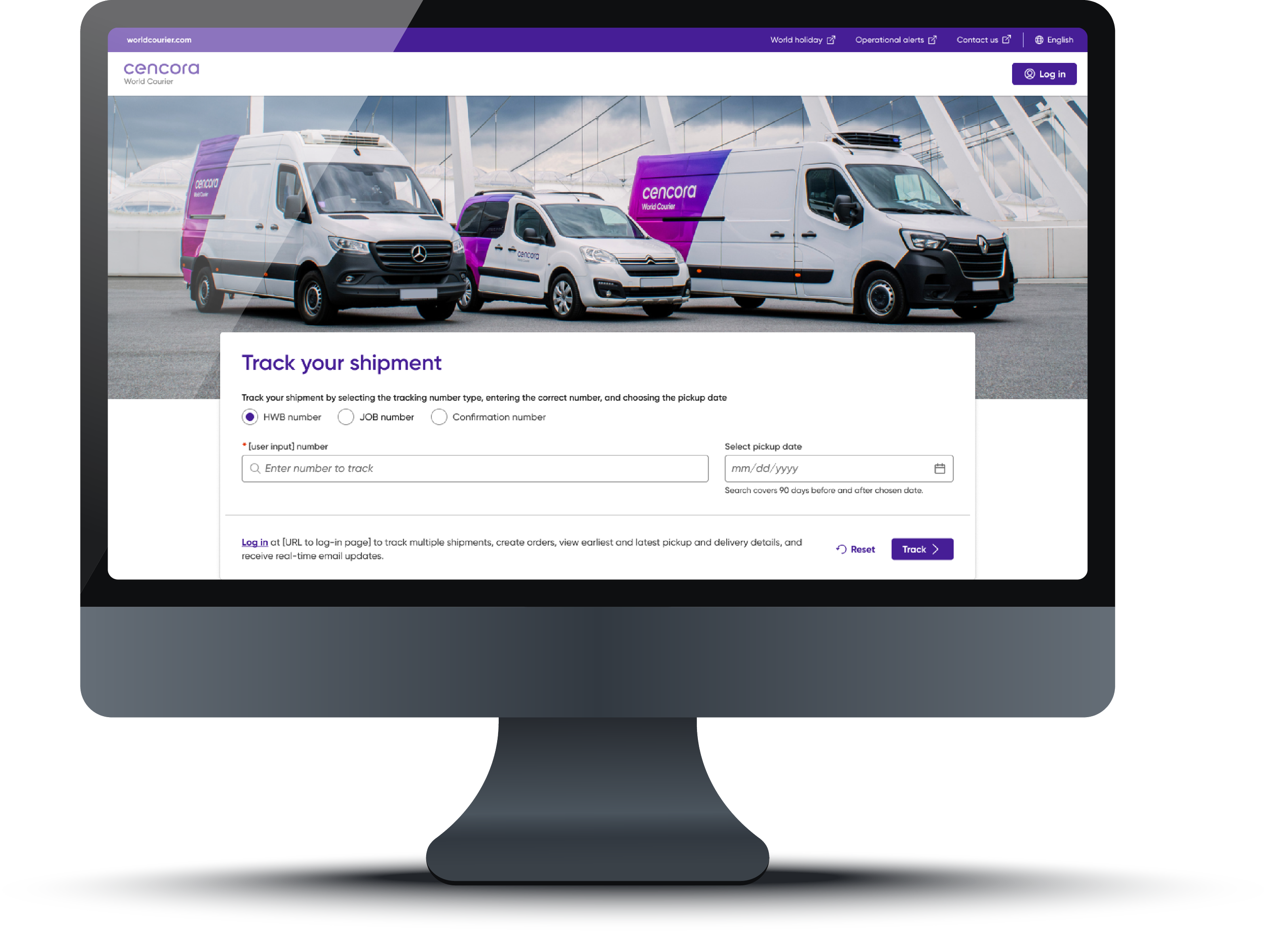
The following images illustrate a comparison between the existing design and the proposed UI update, which aligns with the design system.
It was also essential to improve the way the portal provides feedback to customers, especially regarding errors, in combination with enhanced self-service tools and accessible customer support, to ensure users can recover and resolve issues independently. I iteratively sketched and prototyped updates to the three core workflows:
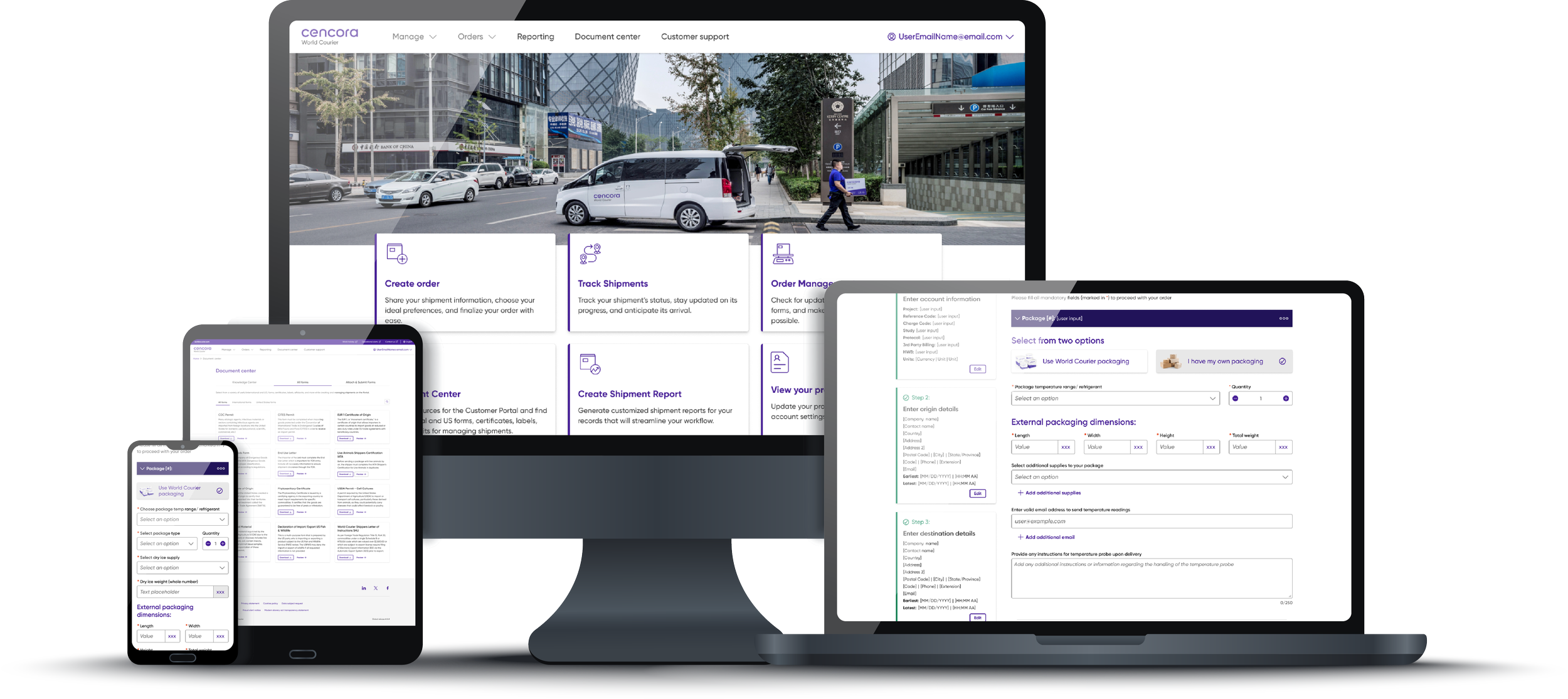
Order Entry – Simplified forms with saved preferences and inline validation
Tracking Page – Enhanced status indicators, exception alerts, and a delay visibility panel
Reporting Workflow – Ability to save and re-run reports, autofill data, and export options
I also refreshed the homepage, introduced a scalable component library that adheres to accessibility standards, and set the foundation for a future redesign of the knowledge center. The following images illustrate a comparison between the existing design and the proposed UI update, which aligns with the design system.
The Solution
Final designs and development handoff with accessibility annotations
I had the chance to showcase the prototype of the final designs to leadership and stakeholders for their approval, which involved:
Streamlined workflows for order creation, tracking, and reporting
Personalized experiences, with account-based default settings and autosave
Accessible and compliant design, improving inclusivity and usability for all users
Modernized UI components, aligned with Cencora’s branding and internal design system
I provided developers with detailed guidance on how the internal design system integrates with legacy components. I also included accessibility annotations to assist with keyboard navigation, error alerts, and creating accessible tables.
Further validation with CP customers
The team recognized the importance of validating our design decisions, and we conducted customer interviews and a focus group with five users of the Customer Portal (CP). These sessions examined participants’ roles, their experiences with the platform, and their feedback on key workflows: Create Order, Track Shipments, and Order History. Overall, users responded positively to the updated prototype, emphasizing its ease of use and expressing overall satisfaction. Suggestions outside the scope of the project were recorded and shared with the World Courier team for future review.
The Impact
A Structured Approach to Portal Enhancements and Development Training
Based on customers’ positive feedback, we are implementing redesigned workflows to improve the efficiency and clarity of the CP. We have also collaborated with the development team to train them on best practices for accessible development and QA. While metrics from the live portal are still pending launch, early data shows improvements in overall team collaboration and the portal experience. Additionally, multiple user suggestions that were out of scope, such as QR-based tracking and third-party billing integration, were captured and forwarded for future roadmap inclusion.
Reflection
This project emphasized the importance of thoroughly understanding user needs prior to making design choices, particularly in enterprise tools where even minor modifications can impact entire workflows. It also underscored the importance of promoting digital accessibility as a fundamental mindset and workflow change, rather than just an additional task, to improve the digital experience for everyone.
What I learned:
The power of heuristic evaluation as a conversation starter with stakeholders
How to balance accessibility, business constraints, and user needs
The importance of establishing ongoing feedback loops for consistent improvements and updates to the portal.
What I’d do differently:
I would have recommended getting earlier feedback from customers to better understand their mindset and workflow. This approach could simplify decision-making and improve stakeholder engagement.